CBS Interactive
Creating new ways to show sports content through multiple platforms
Masters Product Design Intern, CBS Sports
May-July 2015
CBS Interactive (CBSi) is the media arm of CBS Corporation. Delivering a wide variety of content from world news to sports and more, CBSi aims to reach users on all major platforms. CBS Sports, the division I interned with, focuses primarily on professional US sports league news through CBSSports.com with several other products looking at related sports content.
Over the course of my ten week internship, I was a visual designer and prototyper primarily working on future features for CBSSports.com on desktop. I sketched and created visual mockups of new features for CBSSports.com. I also built multiple web prototypes based on requirements and visual mockups to show samples of the interactivity and experiences the Product Design team was thinking about across different screen sizes.
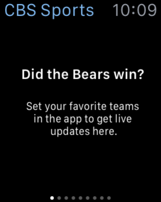
CBS Sports on Apple Watch Redesign Exercise
A proposal of what sports updates and news could be shown on the Apple Watch
UX and Visual Designer
2 week Project
“Design Question: How can news and other sports content be displayed at a glance on a novel device?”
CBS Sports designed an Apple Watch app when the device was first released. With the release of watchOS 2, there were a lot more features to consider. The app also had a slow run time - since it would need to be re-architected for performance, I was given the opportunity to propose what the app could look like if redesigned.
The Making of CBS Sports on Apple Watch
Click on a photo to see more details.
Lessons Learned
A glance is incredibly short - a glance is shorter than a second, so the information in a notification has to be short, succinct, and digestible. In the long version the text has to be short enough to be visible without scrolling, which was a challenge to do even with the shorthand that is already in the mobile application. Mixing visual elements with information was a constant balancing act.
User research is invaluable - in a perfect world, I would have been able to spend a few days with a device to understand the design patterns through doing rather than reading about them along with setting up a diary study or some form of research activity to understand how users are currently using the CBS Sports app and their devices in general. But this was a side project for my internship, and the informal interviews I did get were incredibly helpful.
Visual design is an art and a science
Responsive Video Resizing
A series of prototypes demonstrating resizing and repositioning of web elements for multiple screen sizes.
One of the design challenges for CBS Sports products is to make sure they work on multiple screen sizes. When considering new features, the design team needs to know how the feature might need to be reworked when displayed on mobile and tablet web browsers. For this scenario, the team was looking at optimizing the size of video players within a web page.
““Design question: what is the impact of different screen sizes and devices on information organized on a page? How do we reorganize information to account for these changes without altering a user’s mental model significantly?””
I built a series of prototypes that demonstrated how UI featuring full size videos and video player modules could resize responsively for multiple screen sizes. Given a set of requirements and no restrictions on what web libraries I could use, I did some initial research to understand what libraries already exist in the space, created assets based on the designs handed off to me to make the page resemble the designs as closely as possible, and prototyped the web pages with JavaScript. I stayed away from using web libraries as possible to keep the prototypes simple and lightweight.
Lessons Learned
Prototype code is definitely throwaway code - for these prototypes my focus was to make sure the experience was optimized for, which means I had a lot of unoptimized code. Although I commented my code to understand what I was doing, it was not at all production ready.


